PORTFOLIO
Some of the branding and design work done for our clients in recent times.

HILLESUM MICROFARMING
Challenge:
To create a billboard design for a microfarming venture that would be fun, memorable, and easy to see on a busy stretch of highway.
Solution:
The bold pink background and smiling farmer are eye-catching; text is simple and bold, so it can be read by people passing by at high speeds. The colour scheme was later used for a farm stand selling vegetables grown by the microfarmers, brochures, and business cards.

W.J. STANKIEWIC
Challenge:
To set up a memorial website for a political philosopher with a short biography, list of writings, and comments.
Solution:
The use of monochrome scans of linocuts featured in some of WJS's books made for an elegant yet simple look appropriate for a site dedicated to a scholar and renaissance man.

STONEGATE PROPERTIES
Challenge:
To rebrand a Commercial Property Investment and Management company.
Solution:
We chose navy as the main colour and used a serif font for the logotype to denote trust. We added a stylized letter S in bright green to make the whole more modern and to indicate the company's commitment to improve the health of its buildings and reduce the "footprint" their operation leaves on the world.
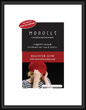
MONOCLE CONDOMINIUMS
Challenge:
Branding for a condominium development in Toronto that was to appeal to a wide demographic and have a name linking it to the eye care store on the ground floor.
Solution:
Monocle Condominiums has a playful look that feels both young and timeless at the same time. Variations of the design and photo were used for a billboard, posters and a website.

MIRCHEFF & MIRCHEFF
Challenge:
Custom "business card" website for small property law firm.
Solution:
Matched website to client's business card and stationary, keeping colour scheme and font styles.

SRA
Challenge:
Business card for Stonegate Realty Advisors was to inspire confidence, yet also represent the youthfulness and drive of the company principals.
Solution:
The neutral grey line drawing and text contrast with the bright red logotype, which adds energy. The website ties in with the same colour scheme.